ARA BY NK | LOGO DESIGN & BRAND IDENTITY
From the initial idea of recreating a cozy corner of Vietnam on a bustling street in Korea, Ara by NK is the embodiment of cultural exchange and love for Korean cuisine. With crispy fried chicken, golden corndogs and unique flavors, the restaurant is not only a place to enjoy food but also a bridge to bring customers to the quintessential values of the land of Kim Chi.
What's more special is that the owner of Ara by NK is not Korean but a Vietnamese with the desire to fully recreate Korean culture in every dish, every detail. This is not an easy journey - "bringing the bell to strike foreign lands" requires not only sincerity, but also a strong brand story to affirm the difference.
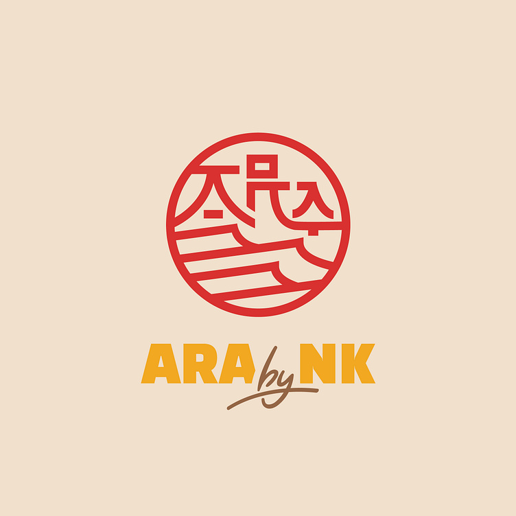
Bee Art team has devoted all their heart and soul to thoroughly researching Korean culture, conceiving the logo of Ara by NK that is full of Korean tradition. The brand name “Ara” means the vast ocean. To realize this, Bee Art has chosen a creative direction: stylizing the brand name Ara based on the image of the Hanbok dome - a symbol associated with Korean tradition combined with wavy lines reminiscent of the ocean. This is also the impressive point that made the owner of the Ara by NK brand decide on this logo right from the first version.
Designed by Bee Art
-
Client Ara by NK
Logo and Branding Project. Logo is design for Korean cuisine restaurant.
Copyright© Bee Art. All Right Reserved
Contact us:
• Hotline/ Zalo: (+84) 77 34567 18
• Email: info@beeart.vn
• Website: www.beeart.vn
• Facebook: https://www.facebook.com/BeeArt.vn


