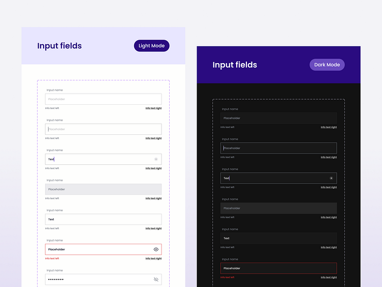
Redesigned Design System for Greater Efficiency
Stepping into an existing design system is always a challenge, period.
Each designer has a different background, a way of creating components, or a preference for setting up the design system. But it doesn't mean everything is up to the designer's preferences or imagination.
There is always the other side of the coin — developers, who need to know what is what, how to use it, and have everything optimized for them.
And that was my job here. To make it happen.
Challenges faced
The system was extensive and complex, with tons of scattered components. The biggest challenge? Reorganize everything without breaking even a single component and enrich existing assets with necessary properties and variants.
Strategic restructuring
I took it piece by piece, dividing assets into 3 main categories: mobile, web, and universal. Then, every component had to be split separately into light and dark modes to follow an existing pattern. And lastly, properties had to be aligned to follow the same naming convention.
Client and developer satisfaction
After a couple of weeks of dedicated work, the system received a much-needed refresh. The client now clearly understands the system, and developers can implement it with attention to detail and joy, leading to increased quality all around...
We are available for new projects!
Drop us a message at contact@swmansion.com
Don’t forget to follow our Software Mansion Dribbble profile!

