Payment Services Logo
Modern Payment Solution Branding Design.
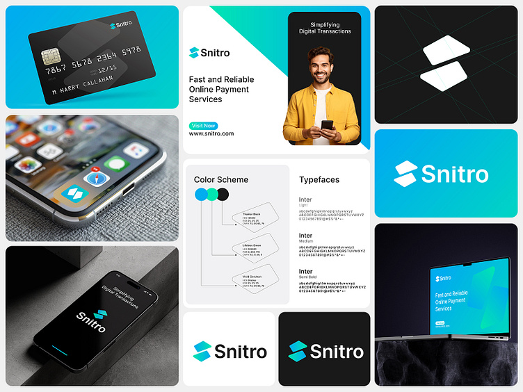
The branding design for Snitro, a fast and reliable online payment service, reflects a sleek and modern identity tailored to a digital-first audience. With a focus on simplicity and functionality, the brand elements are carefully crafted to communicate trustworthiness and innovation.
Logo and Iconography
At the heart of Snitro’s branding is a dynamic logo, featuring a minimalist yet recognizable symbol. The design uses clean geometric shapes in a gradient blue and cyan palette, evoking a sense of motion and connectivity. This visual approach enhances brand recall while aligning with the tech-forward nature of the service.
Color Scheme
The color palette is thoughtfully selected to exude professionalism and reliability. Shades of cyan and teal paired with neutral black and white ensure visual harmony across digital and print mediums. These colors signify security and technology while adding a fresh, approachable vibe.
Typography
The brand uses the Inter typeface family, a modern sans-serif known for its readability and versatility. Different font weights are utilized for hierarchy and clarity, from bold headers to light, informative text, ensuring a seamless user experience across all touch points.
Applications
The branding extends seamlessly across various platforms, as shown in the collateral. From business cards to mobile apps and outdoor advertisements, Snitro’s identity is cohesive and adaptable. The brand's appearance on digital interfaces, such as smartphones, highlights its usability in real-world applications, further reinforcing its relevance.
Snitro’s branding is a testament to the power of cohesive and modern design in building a recognizable and trustworthy digital presence. The integration of geometric visuals, vibrant colors, and clean typography ensures the brand stands out in a competitive fintech market while maintaining a user-friendly and professional aesthetic.


