Test Infrastructure Subscription, SaaS
Key Features of the Subscription Screen
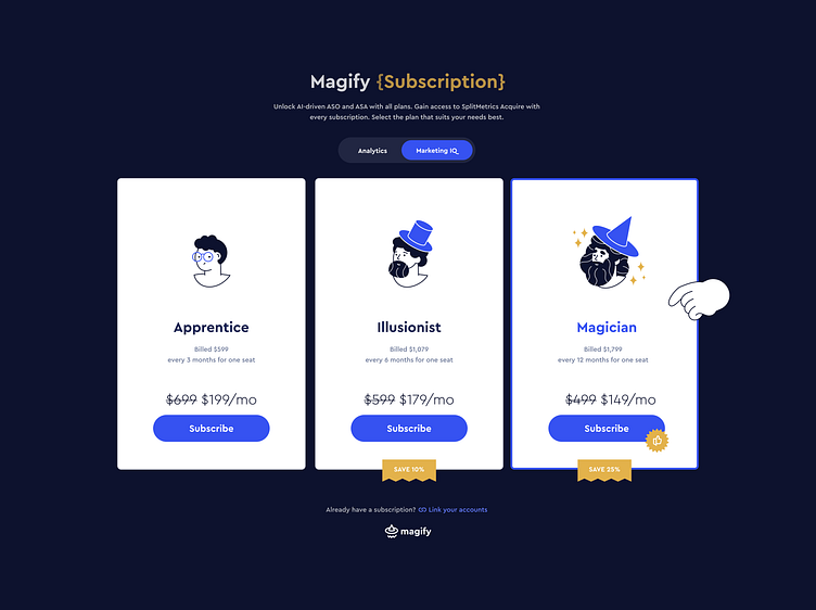
The subscription screen for Magify is designed in a friendly style with a magical theme that reflects the brand’s concept: a combination of AI-powered analytics and a “magical” approach to achieving success.
Subscription Levels — Association with Wizard Castes Subscriptions are divided into three levels, each associated with a specific “wizard caste,” adding interest and enhancing the brand’s magical atmosphere:
Apprentice — the basic level, ideal for small teams or beginners.
Illusionist — the mid-tier level with 10% savings, for those who want to deepen their analytics and optimize results.
Magician — the premium level with 25% savings, designed for experienced teams and large projects. This plan is visually highlighted with sparkles and the wizard hat from the company logo, emphasizing its master-level status and adding prestige.
A wizard hand.
Pointer draws users’ attention to key interface elements, such as CTA buttons, which boosts conversion rates. Users quickly notice important calls to action, reducing time to the target click and increasing the CTR (Click-Through Rate). This pointer adds friendliness to the brand, standing out on the screen and creating the feeling of a “guide” or magical assistant. This approach supports the platform’s magical theme and enhances the emotional connection with users, making the interaction experience more intuitive and unique.
Non-standard elements, such as a custom cursor, influence key behavioral metrics: users become more engaged, spend more time on the site, and increase the number of interactions with the interface. This is supported by research in gamification and UX design, where unusual interactive elements positively affect product perception and user retention. All of this helps the brand stand out from standard solutions, making the interface original, visually appealing, and ultimately contributing to achieving high conversion rates. Such a cursor might be perfectly on a promotional website.
Switching Between "Analytics" and "Marketing IQ" At the top of the screen, there is a toggle that allows users to choose between the platform’s two main areas. This helps users focus on the necessary tools and improves UX metrics, such as navigation ease and time to find the desired section.
Linking Accounts with an Active Subscription At the bottom of the screen, there is a link for current users: “Already have a subscription? Link your accounts.” This makes the connection process smooth and comfortable, reducing friction and increasing retention.
Design and Perception Subscription cards are designed in a minimalist style with wizard illustrations, making them clear and memorable. “Subscribe” buttons stand out and direct users to take action. Discounts for long-term plans are visually emphasized with labels (e.g., “SAVE 25%”), making the value of subscriptions clear and motivating users to choose more cost-effective options.
Overall Impression The Magify subscription screen combines structure and simplicity with a magical atmosphere, supporting an emotional connection with users. This approach increases conversion rates, improves behavioral metrics, and makes the platform more appealing and memorable.
