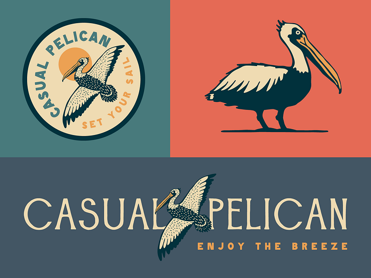
Casual Pelican Brand Identity & Custom Fonts
Casual Pelican is an outdoor and coastal apparel brand that embodies the laid-back, timeless spirit of seaside life. The brand’s identity is rooted in a natural, organic aesthetic that feels comfortable and lived-in, inviting wearers to embrace a relaxed and carefree lifestyle. The color palette, featuring soft blues and teals, evokes the calm of the ocean and the vibrant hues of a coastal sunset, with warm yellows, oranges, and reds bringing a sense of warmth and adventure. This combination of colors creates an atmosphere that’s both serene and energizing, reflecting the dynamic yet peaceful nature of coastal living.
The brand's logo and mark designs emphasize versatility and responsiveness. The pelican, a symbol of the brand's connection to the outdoors, is represented in multiple variations — in flight, in side profile, and perched on a pylon — allowing for adaptability across different applications. Whether sized down for embroidery on a polo or used in full color on tags and advertisements, these responsive logos maintain their integrity and clarity. The design choices reflect the brand’s commitment to providing a relaxed, nature-inspired aesthetic that is both functional and timeless, ensuring Casual Pelican feels like a trusted companion for every coastal adventure.
All About the Custom Fonts
For this brand identity project, I created two custom fonts that complement each other seamlessly while adding unique character to the brand's visual identity.
Driftwood
The first font is a striking, all-caps serif display font that blends classic letterforms with a handwritten feel. It features slight serifs that give it a sense of sophistication and structure, while the stylized letterforms add a playful and unique character. The slight irregularities in the strokes give it an organic, human touch. This font conveys creativity, elegance, and a sense of approachability, which works well to communicate the brand’s personality.
Marsh Hen
The second font is a bold, blocky sans-serif typeface with all-caps, also designed in a handwritten style. Its clean, modern forms with a slight roughness provide a stark contrast to the serif font, but without feeling out of place. This font feels strong and confident with its sharp, geometric edges, while the handwritten quality gives it a personal and informal edge. It works well for subheadings, body text, and other supporting elements that need to balance the more decorative serif font while maintaining clarity and impact.
How They Work Together
The combination of these two fonts creates a dynamic and harmonious contrast. The serif font’s sophisticated yet handwritten quality pairs well with the bold, geometric sans-serif font, which grounds the overall design with its solid, straightforward presence. Both fonts share a handwritten quality, allowing them to feel unified despite their differing styles—one leaning towards elegance and the other towards strength. Together, they build a visual hierarchy where the serif font captures attention with its flair, while the sans-serif provides balance and readability.
This pairing brings a sense of personality, energy, and balance to the brand identity, allowing the typography to reflect both creativity and professionalism.


