Knowledge Sharing : December Series / Day 11
☃️Day 11 of December Series.....
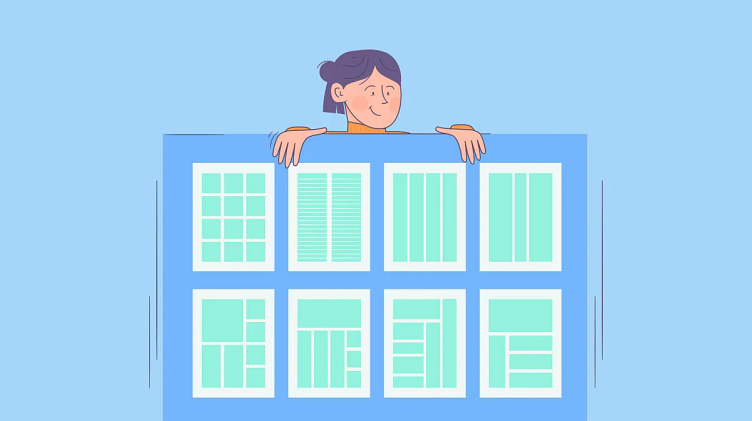
👉 Grid systems are essential in mobile app design as they help maintain consistency, alignment, and organization within the user interface.
🎯 Here's how grid systems are used in mobile app design:
✅ Column Grid: Mobile app designs often use a column-based grid system, similar to web design. Columns help to structure content horizontally and maintain alignment across different screen sizes. Common column widths in mobile app grids include 12 columns or 8 columns.
✅ Baseline Grid: A baseline grid consists of evenly spaced horizontal lines that determine the vertical rhythm of the layout. Elements such as text, icons, and buttons are aligned to the baseline grid to create a harmonious and visually pleasing interface.
✅ Module Grid: A module grid divides the screen into modular units or blocks, each containing specific content or functionality. This approach helps designers organize complex layouts and maintain consistency in the placement of elements.
✅ Responsive Grid: Mobile app designs must be responsive to accommodate various screen sizes and resolutions. Responsive grids use flexible or adaptive layouts that adjust automatically based on the device's screen size, ensuring a consistent user experience across different devices.
✅ Gutter Width: Gutters are the spaces between columns or modules in a grid layout. Designers specify gutter widths to create visually appealing spacing and separation between elements. Common gutter widths in mobile app design range from 8 to 24 pixels.
✅ Grid Alignment: Elements within the mobile app interface are aligned to the grid to maintain visual order and hierarchy. Alignment to the grid ensures that elements are positioned consistently and accurately, improving readability and usability.
✅ Grid Overlay:Design tools such as Sketch, Adobe XD, and Figma provide grid overlay features that allow designers to visualize the grid system directly on the canvas. Grid overlays help designers align elements more efficiently and maintain grid consistency throughout the design process.
------- 💡 By using grid systems effectively in mobile app design, designers can create visually appealing, well-structured interfaces that enhance usability and provide a consistent user experience across different devices and screen sizes💡.......
Thanks for your Patience 😊🌱
➡️Follow me (Subarathna K) for more like this.
hashtag#uiux hashtag#uiuxzone hashtag#uiuxdesigns hashtag#uiuxdesigners hashtag#uiuxofficial hashtag#uiuxindia hashtag#uiuxunlimited hashtag#dailyuiux hashtag#mobileuiux hashtag#uiuxcafe hashtag#uiux_inspiration hashtag#uiuxcreative hashtag#uiuxcollective hashtag#uiuxinspirations
