RENOVENT Real Estate Branding Design
RENOVENT Real Estate Branding Design
Elevating the Future of Real Estate!
Introducing the brand identity for RENOVENT, a forward-thinking real estate company. This design captures the essence of trust, reliability, and modernity.
✨ Design Highlights:
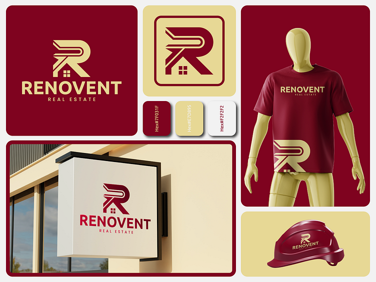
Logo: A bold and memorable “R” with a house silhouette, symbolizing innovation and homeownership.
Color Palette: A sophisticated mix of deep burgundy (#7D031F) and soft beige (#F2F2F2) for a balance of professionalism and warmth.
Applications:
Office signage
Uniforms and merchandise
Construction gear branding
🎨 Typography & Colors: Carefully curated to communicate a sleek, upscale, and approachable identity.
💡 What do you think of this design? Your feedback and love are always welcome! 💬❤️
#Branding #RealEstateDesign #LogoDesign #BusinessIdentity #CreativeDesign
What do you think of this concept? Let me know in the comments below! 💬✨
Don't forget to Press 🧡 if you like it!
Interested in working with me:
Get in touch with me:
WHATSAPP | BEHANCE | LINKEDIN | INSTRAGRAM


