Hoistto Brand Identity
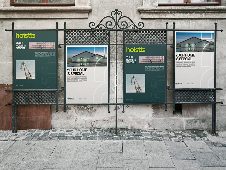
Hoistto is a building firm situated in St. Brooklyn, New York, that specialises in creating homes that are suitable for raising a family. Every phase of life is made unforgettable by the way everything is designed. Their minimalist approach to every home design they create serves as a visual representation of their extensive knowledge. Safety is their top priority, and they offer a variety of services with environmentally friendly goods to reduce pollution as much as possible.
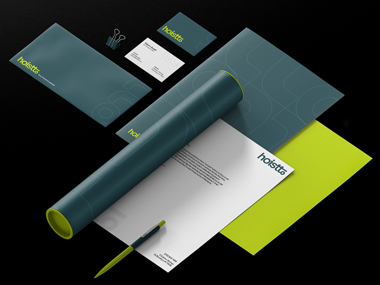
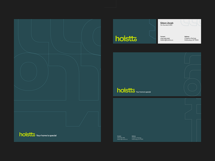
The logotype's bold, compact typeface and lowercase letters offer them a welcoming appearance while showcasing their industry prowess. The letters "t" and "o" stand for a construction crane. It has a more grounded vibe because to the subdued Dark Slate Grey colour, while a hint of vitality is added by the contrasting Bitter Lemon colour. The fact that all of the online elements and printing materials fit into grids precisely shows how well-organised and structured they are. The purpose of Hoistto is to develop meaningful housing for people who wish to raise their children in a family setting.
Click Here to view whole project.