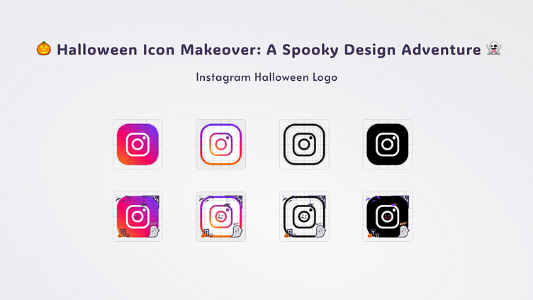
Halloween Icon Makeover - Instagram
Halloween Icon Makeover - Instagram
Hey all👋🏻,
Project Overview
This design challenge aimed to breathe new life into the familiar Instagram icons, transforming them into a spooky and playful Halloween-themed set. The goal was to create a cohesive and visually appealing set of icons that would enhance the user experience while capturing the spirit of Halloween.
Design Process
Brainstorming: A list of classic Halloween elements (ghosts, witches, pumpkins, bats) was generated to inspire the design direction.
Sketching: Initial sketches explored different styles and approaches, balancing simplicity with Halloween-themed details.
Icon Deconstruction: Existing Instagram icons were broken down into basic shapes and elements to facilitate the integration of Halloween elements.
Halloweenification: Spooky elements were added to each icon, maintaining their original functionality and recognizability.
Color Palette: A Halloween-themed color palette was created using shades of purple, pink, and orange, complemented by dark backgrounds to create a spooky and vibrant aesthetic.
Typography: A bold, sans-serif font was chosen for the icon labels, adding a touch of gothic flair.
Digital Design: Sketches were refined in Figma, paying close attention to detail, ensuring clarity, and optimizing the icons for various screen sizes.
Testing and Iteration: Icons were tested on different devices and screen sizes to ensure readability and visual appeal. Iterations were made to refine the details and improve the overall aesthetic.
Key Design Considerations:
Brand Consistency: The Halloween theme was integrated seamlessly with Instagram's existing brand identity.
Usability: Icons remained functional and recognizable, even with the added Halloween elements.
Visual Appeal: The design was visually striking and engaging, capturing the spirit of Halloween.
Accessibility: Icons were designed to be clear and legible, even in small sizes.
Lessons Learned in the process:
Balance is Key: While it's fun to go all out, it's important to maintain readability and usability.
Details Matter: Small details can make a big difference.
Testing is Essential: Test your icons in different contexts and on various devices to ensure they look good and function well.
Future Directions:
Create Mockups: Design mockups of Instagram screens incorporating the new Halloween icon set to visualize the overall impact.
Explore Dark Mode: Develop a dark mode version of the icon set to enhance visibility and user experience in low-light conditions.
Animate the Transition: Experiment with subtle animations to create a seamless transition from the standard icons to the Halloween-themed ones when the user hovers over them.
By continuing to explore these avenues, we can further elevate the Halloween icon set and create a truly immersive and engaging user experience.
Hope you like it !
Feel free to give your suggestions for improvement.
And press [ L ] if you ❤️ it! :-)
I am available for new UI design projects!
Drop a mail at Bhawana.CreativeStudio@gmail.com


