Sunrei: Riding the Wave of Vibrant Brand Identity
Sunrei: A Radiant Brand Identity
When designing the visual identity for Sunrei, an action sports brand that embodies movement, optimism, and forward-thinking energy, I set out to create a design system that captures the essence of light, growth, and innovation.
Logo Design
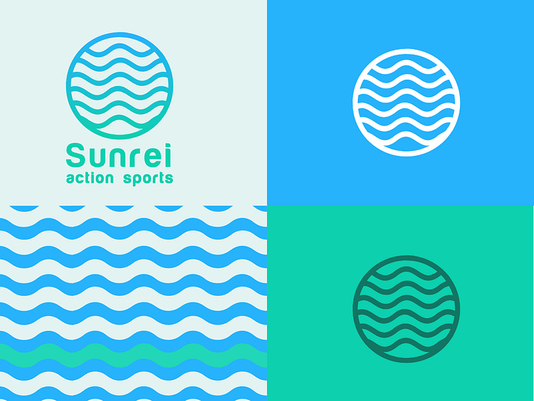
The logo seamlessly blends simplicity and symbolism. Its clean lines and wave-inspired motif convey energy and positivity. The bold yet approachable typography anchors the brand, making it memorable and versatile across applications.
Custom Patterns
To add depth and cohesion, I developed a series of bespoke patterns inspired by sunlight, movement, and natural textures. These patterns serve as versatile design elements, adaptable for packaging, marketing materials, and digital platforms, creating a dynamic yet consistent visual language.
Brand Identity
From the colour palette to typography choices, every element of the Sunrei brand identity was thoughtfully curated to reflect its mission of inspiring and uplifting its audience. The palette incorporates blues and calming green, striking the perfect balance between vitality and nature.
Key Deliverables
• Logo Design: Modern, meaningful, and scalable.
• Pattern Design: Unique and versatile visuals that bring the brand story to life.
• Brand Identity: A cohesive system designed for seamless application across print, digital, and social platforms.


