Daily UI - 002 - Credit Card Checkout
About this shot
Prompt: Design a credit card checkout form or page. Don't forget the important elements such as the numbers, dates, security numbers, etc.
Previous design: I have to admit—my first attempt at this challenge was purely focused on the visuals. Looking back, I can easily spot several poor design decisions I made. For instance, the low contrast of the text fields and other texts, the use of a radio button to save card information (yikes!) instead of a checkbox, and the stepper indicating a middle step when the primary action says "Finish."
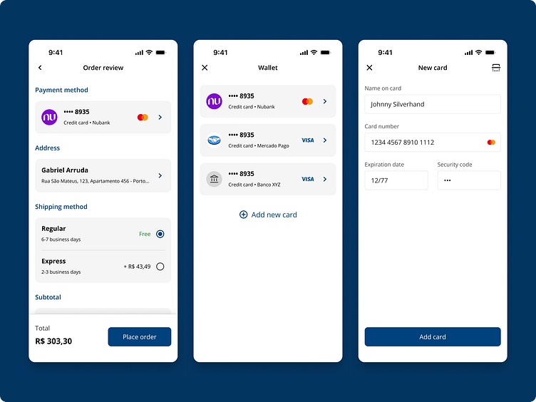
Redesign: This time, I focused on creating a better and more intuitive checkout flow. The first step of this flow is the "Order Review" screen, which includes several standard e-commerce checkout options, such as payment method, delivery address, and shipping method. If the user needs to select a different payment method, the app/website opens their wallet, where they can choose another card or add a new one.
I also prioritized consistency, information hierarchy, and interaction patterns to ensure that users can easily recognize and understand each interaction and what settings they are configuring. In addition, I designed the interactive elements to be easily componentized within a design system, ensuring greater consistency throughout.
Comparative
Have any feedback or questions about this design? Feel free to share your thoughts! 😊


