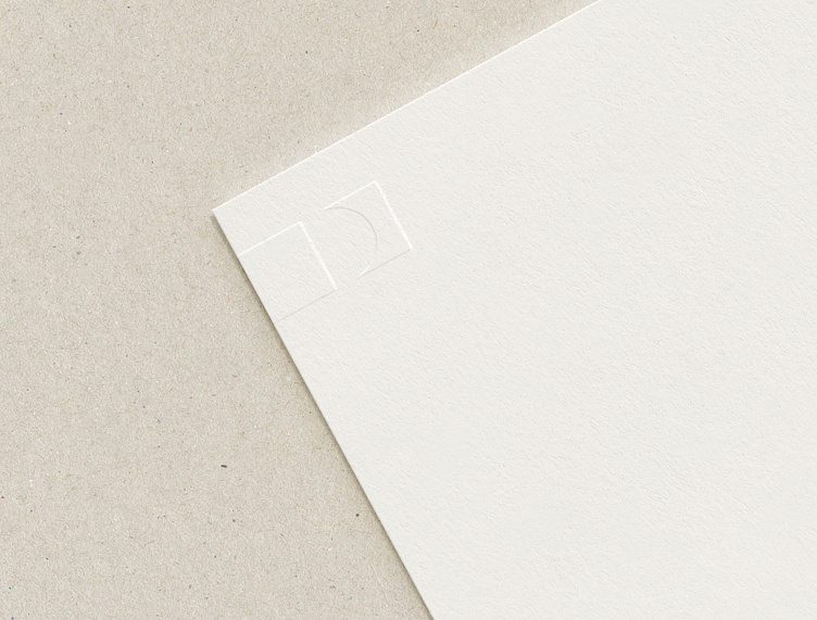
Distinction Logo Presentation
Here’s a look into the Logo Design Presentation I prepared for Distinction™. It’s come so far since then! ✨
Our aim was to make Distinction look as great as it actually is.
Both the client and I wanted the brand to align with the business, be instantly recognizable, and communicate a honest and authentic message to their ideal audience—with clarity.
BRAND VALUES
Honesty
Clarity
Authenticity
Humanity
Relevancy
BRAND AESTHETIC
Simple
Approachable
Clean
Engaging
Professional
Our mission was to refresh the Distinction™ logo to reflect its true personality.
The speaker coaches’ craft is to shape the unremarkable into the unforgettable.
The rectangle on the left is typical. The rectangle on the right has curves, varied widths, and tapered edges carved within. Distinction is “a difference or contrast between similar things”—exactly what this symbol illustrates.
The arrangement is designed to represent the difference that Distinction™ delivers. It intentionally creates an uppercase “D” in the negative space, reinforcing the company’s initial.
A humanist-style font (modeled after classical Roman capitals) sets the logotype. It contains a degree of unevenness common in calligraphy. This characteristic nods to human involvement in the typography.


