Project CETI: Design Case Study
Project CETI's rebranding and website design seamlessly blend a nod to its past with a vision for the future.
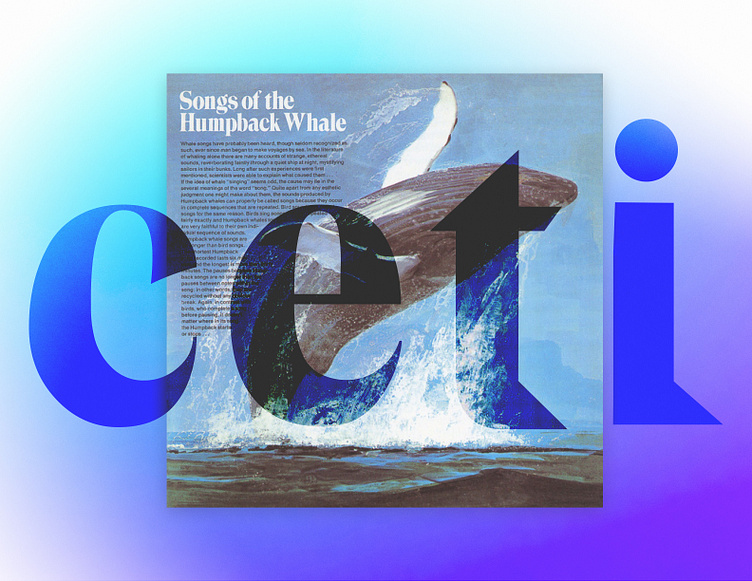
In the 1960s, Dr. Roger Payne, CETI’s principal adviser, captured the world’s imagination with "Songs of the Humpback Whale," featuring the expressive Trooper Roman typeface. Inspired by this, we sought a modern evolution of that font for CETI’s rebrand. Enter GT Super: a versatile typeface that bridges the charm of vintage design with the functionality required for both web and print. It’s a subtle yet meaningful nod to Payne’s legacy and the timeless connection between humans and whales.We chose Söhne as CETI’s secondary font. In "Songs of the Humpback Whale," Helvetica was used, and Söhne, designed as a tribute to Helvetica’s heritage, felt like the perfect modern choice. Its versatility and readability across dynamic backgrounds make it ideal for digital storytelling. Plus, the name "Söhne" evokes the word "song," echoing the core of CETI’s mission to decode whale communication.
To complement this thoughtful typography, we crafted a color palette that reflects CETI’s optimistic vision. Cool blues, paired with soft gradients, remind us of water while bold purples call to mind the deep ocean, distinguishing CETI from traditional marine nonprofits. Throughout the site, design elements like sound wave shapes and dot-and-line patterns celebrate the whales’ morse code-like communication, echoing CETI’s mission to decode their language and connect us to other species.
The aesthetics of this redesign were so fun to dive into and we loved connecting the designs to CETI’s story of discovery, innovation, and hope.
Photo image source: https://fontsinuse.com/uses/17290/songs-of-the-humpback-whale-album-art


