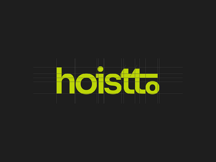
Hoistto Logo
The logotype's bold, compact typeface and lowercase letters offer them a welcoming appearance while showcasing their industry prowess. The letters "t" and "o" stand for a construction crane. It has a more grounded vibe because to the subdued Dark Slate Grey colour, while a hint of vitality is added by the contrasting Bitter Lemon colour.
Click Here to see the full project
More by Rafid Alam View profile
Like


