[LOGO DESIGN] LE LOCUST CAFE
Logo | Branding | Brand Identity
Field: Coffee
--------
Le Locust Café is a coffee brand with a strong Hoi An style, where traditional values meet with modern sophistication. With love and respect for Hoi An culture, Le Locust Café is not only a place to enjoy coffee but also a space to listen to stories and enjoy the unique beauty of the heritage land.
Le Locust Café sets high requirements in logo design to convey the brand's unique spirit. The logo must depict the image of rice fields, grasshoppers and the beauty of Hoi An culture in a harmonious way, showing both closeness to nature and maintaining sophistication and modernity. How to combine traditional elements with a new design style is a big challenge for Kaiza, in order to create a unique and memorable identity in the eyes of customers.
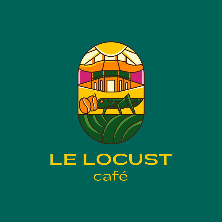
The Le Locust Café logo harmoniously combines the typical symbols of Hoi An, including the Japanese Covered Bridge, rice fields, the sun and coffee beans, creating an image that is both traditional and modern. The image of a grasshopper – a symbol of endurance and connection with nature – is placed in the center, reminiscent of the brand name. The bright color palette and sophisticated design not only honor the beauty of Hoi An but also express the closeness and warmth that Le Locust Café wants to bring to customers.
Designed by Kaiza
Copyright © Kaiza. All Right Reserved
Contact us:
KAIZA CO.,LTD
• P: 0889 996 399
• E: info@kaiza.vn
• W: www.kaiza.vn
Connect me @ Behance - Instagram - Pinterest


