Shiboritate - Sake Label Design
Sake Symphony
Sake Symphony is a harmonious exploration of sake’s diverse styles and traditions. Each label is a visual composition, showcasing the refined flavors and craftsmanship of sake, from the bold richness of Junmai to the delicate notes of Ginjo. With its blend of artistry and culture, Sake Symphony invites you to experience the melody of flavors and visuals that make sake a timeless treasure.
About Shiboritate Sake
Shiboritate Sake: Fresh and Vibrant
Shiboritate sake refers to freshly pressed, young sake that is bottled and enjoyed without aging. The term shiboritate translates to "freshly squeezed" in Japanese, highlighting the sake’s unrefined, vibrant qualities. Unlike most sake, which is typically allowed to rest and mellow for a few months after brewing, shiboritate is bottled immediately, giving it a bold, lively character.
Shiboritate often features bright, fruity, and slightly sharp flavors, with a refreshing, sometimes effervescent quality. Its aroma can be more pronounced, showcasing fresh rice and fruit notes. This style is ideal for those who enjoy the dynamic and raw essence of sake, offering a taste that is as close to the brewing process as possible. Shiboritate pairs well with light, fresh dishes such as sushi, salads, or grilled vegetables, making it a unique and exciting choice for sake enthusiasts.
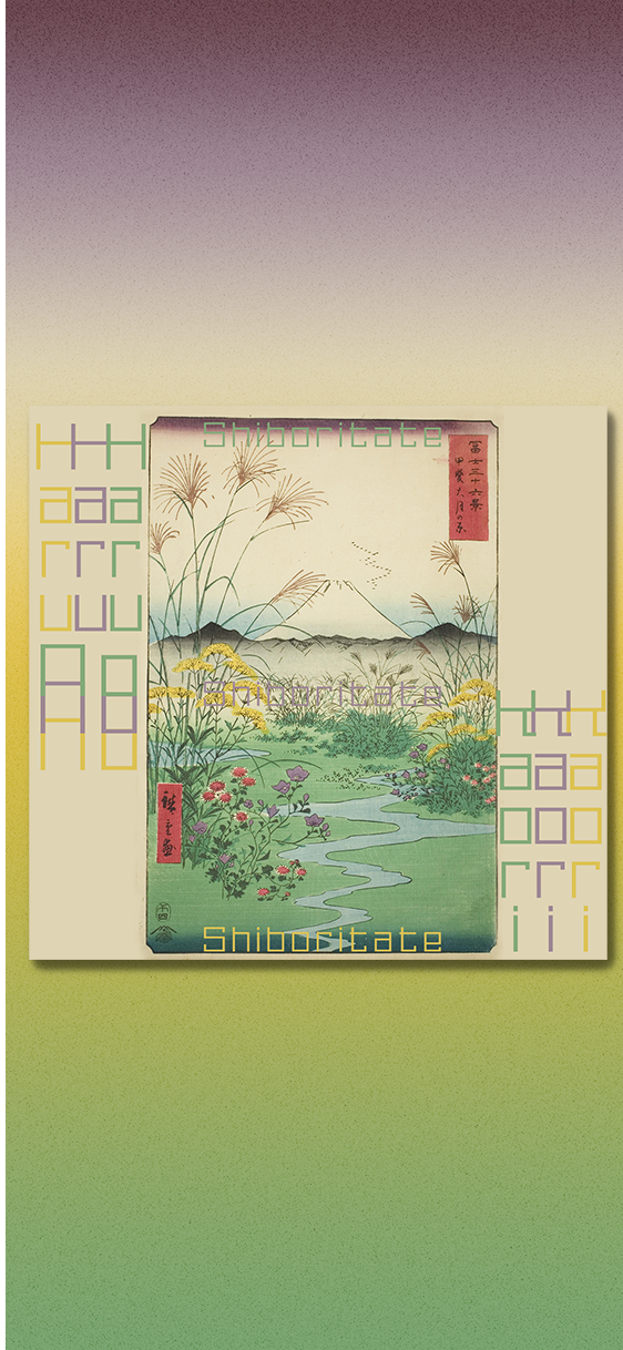
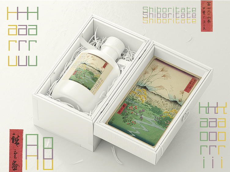
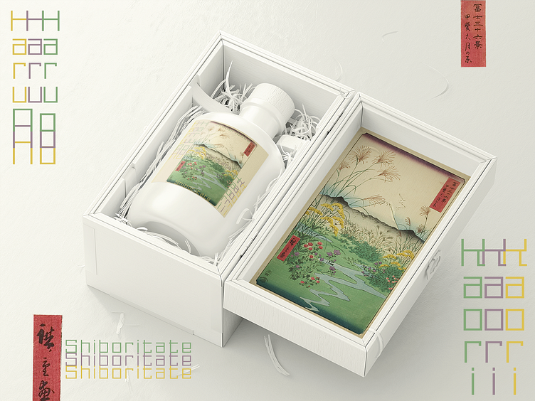
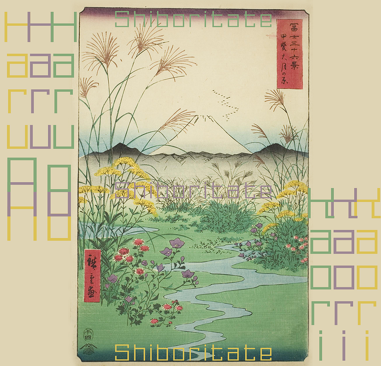
About The Design
The design of the Haru No Kaori shiboritate sake label is a vivid celebration of spring and renewal, perfectly capturing the freshness and liveliness that defines this style of sake. The label features a traditional Japanese landscape, adorned with blooming wildflowers, tall grasses, and a flowing stream. The soft pastel tones of greens, yellows, and purples create a serene and harmonious aesthetic, evoking the gentle arrival of spring and the rebirth of nature.
The name Haru No Kaori, meaning "Fragrance of Spring," ties beautifully to the design and the sake style. Shiboritate sake, with its youthful and vibrant profile, parallels the essence of spring—fresh, dynamic, and full of promise. The lush imagery of blooming fields and flowing water mirrors the raw, unaged nature of shiboritate, inviting the drinker to experience the lively and fragrant qualities of this sake. Together, the name and design create a cohesive narrative that celebrates the purity and vitality of the season and the beverage.

About Me
I run a design and branding studio dedicated to elevating craft producers, startups, and small businesses. With over 350 labels designed and collaborations with boutique brands across the globe, I offer comprehensive services including full brand packages, web development, packaging, and graphic design. If you're looking to bring your brand to life, don't hesitate to reach out. Explore more of my work and past projects at pinewatt.com—I'd love to partner with you on your next creative venture!