Vodka Label Design
Spirits of Distinction
Spirits of Distinction is a design journey through the diverse and storied world of distilled spirits. The goal of the series is to capture the essence of each spirit—from classic gin and whiskey to exotic rums and eaux-de-vie—in a unique label design that reflects its origin, culture, and character. Each label will serve as a tribute to the craft of distillation, blending tradition with visual artistry to celebrate the spirit’s individuality and history. With Spirits of Distinction, every bottle tells a story, inviting you to explore the world one spirit at a time.
About Vodka
Vodka: A Versatile and Neutral Spirit
Vodka is a distilled spirit celebrated for its clean, neutral flavor and smoothness. Originating in Eastern Europe, particularly Russia and Poland, vodka is traditionally made from grains or potatoes, though modern varieties can use other ingredients like fruits. It is typically distilled multiple times and filtered to remove impurities, resulting in a pure and crisp profile.
With an alcohol content around 40% ABV, vodka’s versatility makes it a favorite for cocktails like the Martini, Moscow Mule, and Bloody Mary, or enjoyed neat. Its minimal flavor allows subtle differences to shine, influenced by its base ingredients and production methods. Known for its adaptability and cultural significance, vodka is one of the most widely consumed spirits in the world.
About The Design
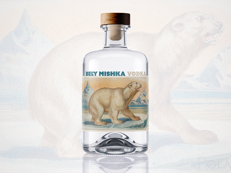
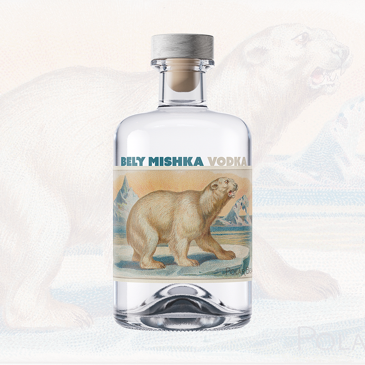
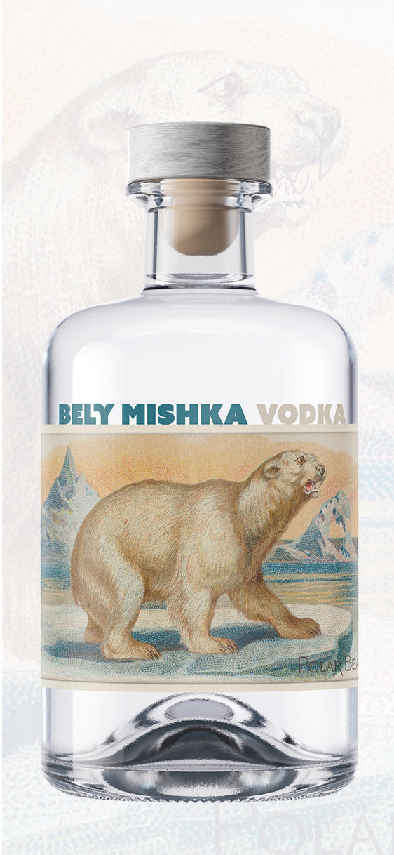
The Bely Mishka Vodka label is a refined nod to the icy elegance and strength often associated with vodka. The centerpiece of the design is an intricately illustrated polar bear, symbolizing resilience, purity, and the cold regions that vodka is traditionally linked to. The soft, muted tones of the bear and the arctic landscape behind it give the label a vintage yet timeless aesthetic, evoking the pristine environments where vodka's origins lie.
The name Bely Mishka translates to "White Bear" in Russian, reinforcing the connection to the polar bear imagery and tying it to Russian heritage, where vodka holds significant cultural importance. The clean typography complements the illustration, balancing tradition with modern simplicity. This label effectively conveys both the purity of the vodka and its strong, enduring spirit, much like the polar bear itself.

About Me
I run a design and branding studio dedicated to elevating craft producers, startups, and small businesses. With over 350 labels designed and collaborations with boutique brands across the globe, I offer comprehensive services including full brand packages, web development, packaging, and graphic design. If you're looking to bring your brand to life, don't hesitate to reach out. Explore more of my work and past projects at pinewatt.com—I'd love to partner with you on your next creative venture!