Double IPA - Beer Label Design
Beer For Here
Welcome to the "Beer For Here" series. Enjoying a beer is not just about the taste; it's deeply influenced by the surroundings in which you drink it. Inspired by this idea, I've embarked on creating a series of beer labels that encapsulate the essence of various locations and aesthetics—melding the distinctive vibe of each place with the rich history of different beer types. This project aims to transform each sip into a more immersive experience, where the beer and its label are in perfect harmony.

About Double India Pale Ale
A Double India Pale Ale (DIPA), also known as an Imperial IPA, is a stronger and hoppier variation of the classic IPA. First emerging in the 1990s during the craft beer boom, this style amplifies everything beer lovers appreciate about IPAs—higher alcohol content (typically 7.5–10% ABV), an intense hop presence, and bold flavors.
Double IPAs boast a rich malt backbone that balances the assertive bitterness and showcases hop-forward aromas of citrus, pine, tropical fruit, and resin. The malt character often adds notes of caramel or toasty sweetness, providing depth and complexity. Despite the higher alcohol and bigger flavors, well-crafted DIPAs remain surprisingly smooth and drinkable.
This style is perfect for hop enthusiasts seeking a beer that pushes boundaries while delivering a balanced and memorable experience. Pair it with bold foods like spicy curries or grilled meats to enhance its intense flavors.

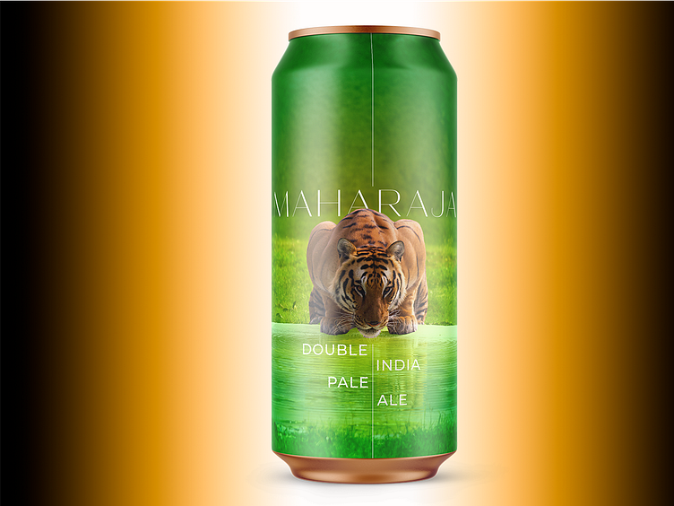
About The Design
The label for Maharaja Double India Pale Ale is a striking design that combines bold imagery with elegant simplicity. The central focus is on the majestic tiger, crouched low by a vibrant green water source, exuding power and intensity—qualities that mirror the bold flavor profile of a Double IPA. The lush green background creates a sense of vitality and freshness, while the gradient effect adds depth and sophistication.
The typography is clean and modern, with "Maharaja" set in a sleek, sans-serif font that conveys regality and refinement. The vertical alignment of "Double India Pale Ale" balances the composition, creating a visually dynamic layout. The aesthetic is minimal yet impactful, blending natural beauty with a sense of luxury and strength, perfectly aligning with the bold and complex character of the beer.

About Me
I run a design and branding studio focused on helping craft producers, startups, and small businesses thrive. With over 350 labels designed and collaborations with boutique brands worldwide, I offer full-service branding, web development, packaging, and graphic design. Visit pinewatt.com to see my work and connect—let’s bring your next creative project to life.