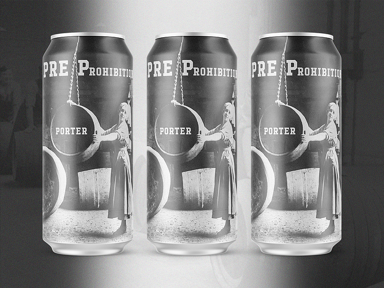
PrePro Porter - Beer Label Design
Beer For Here
Welcome to the "Beer For Here" series. Enjoying a beer is not just about the taste; it's deeply influenced by the surroundings in which you drink it. Inspired by this idea, I've embarked on creating a series of beer labels that encapsulate the essence of various locations and aesthetics—melding the distinctive vibe of each place with the rich history of different beer types. This project aims to transform each sip into a more immersive experience, where the beer and its label are in perfect harmony.
About Pre-Prohibition Porter
Pre-Prohibition porters are a nod to the classic American porter style enjoyed before the temperance movement reshaped the brewing landscape. Inspired by their English counterparts, these beers were brewed with a distinctly American twist, often featuring local ingredients like six-row barley and corn adjuncts. They tend to be slightly lighter in body and lower in alcohol compared to modern porters, with a focus on balance and drinkability.
Flavors typically include roasted malt notes of chocolate, caramel, and coffee, with a mild hop bitterness for a clean finish. These porters were everyday beers for hardworking Americans, bridging the gap between robust English porters and the lighter lagers that would dominate post-Prohibition. Today, they are a celebration of traditional craftsmanship and a slice of brewing history worth revisiting.
About The Design
This design masterfully captures the historical essence of the pre-Prohibition porter beer style. The monochromatic color scheme, with its vintage photographic imagery, evokes a sense of nostalgia, transporting the viewer to the early 20th century when these porters were a staple of American brewing. The central figure—possibly a worker or brewer—handling a large barrel is a powerful nod to the craftsmanship and industrial roots of the era.
The bold, serif typography further enhances the historical theme, resembling signage or advertisements from the pre-Prohibition period. The overall aesthetic balances grit and authenticity, paying homage to the hardworking spirit and tradition behind this classic beer style. It’s a design that resonates deeply with the beer’s heritage, grounding the experience in its rich historical context.
About Me
I run a design and branding studio specializing in craft producers, startups, and small businesses. I offer a comprehensive range of services, including full brand packages, web design, packaging, and graphic design. Feel free to reach out—I'd love to help you bring your brand to life.
Explore more of my work at pinewatt.com.


