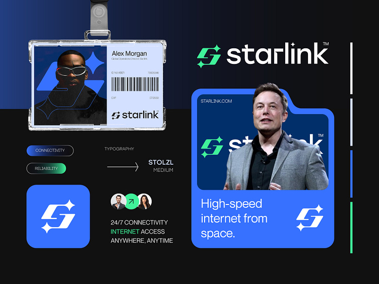
Rebranding Proposal for Starlink™ Internet Provider from Space.
I recently worked on a rebranding project for Starlink™, a satellite internet company. My goal was to create a new logo and brand identity that show Starlink's mission to connect people around the world with fast and reliable internet. I focused on making the design modern and futuristic to match their innovative technology. The final result is a fresh and simple look that reflects Starlink’s values of connection and trust.
Concept: Letter S + Star + Connection Link
Color Psychology: Blue symbolizes trust and reliability, ideal for construction, while purple adds a touch of creativity and safety. Together, they suggest a company that builds secure, innovative homes.
Press "L" to show your love ❤️️
______________________________________________________________________________________________
👉 Say goodbye to ineffective logos and hello to a design that’s both memorable and recognizable!🌟
📩 Available for new projects :
Email: info@rahidrehman.me
WhatsApp: https://wa.me/+8801705553455
Telegram: @rahiddesigner
💡 Follow for more update: Dribbble, Behance, Instagram, Twitter, Linkedin
© Rahid Rehman
