eCycle Management Logo & Branding Design
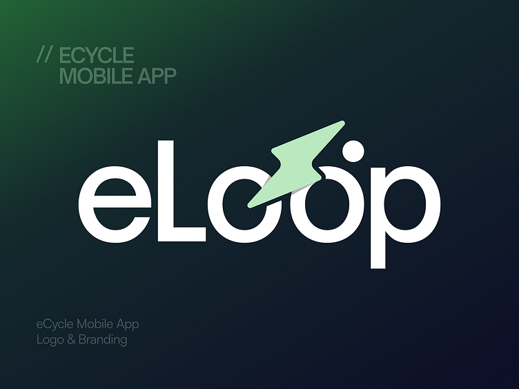
eLoop logo is crafted to represent innovation and eco friendly transportation. Designed for an eBike management mobile app. The logo features a clean, modern style. The lightning bolt icon adds energy to the design, showing speed and sustainability. It’s a perfect match for the brand’s mission of smart, green mobility.
With a focus on simplicity, the logo uses bold typography and a calming color palette. The green reflects nature, while the white adds clarity and trust. This design speaks to users looking for sleek, professional, and impactful branding. It’s more than a logo, it’s a symbol of the future of cycling.
More by Panze - UX Design Studio View profile
Like


