Moodify: Brand Design Case Study
Mental health is deeply personal, yet the stigma surrounding it often leaves individuals feeling isolated and misunderstood. Moodify’s mission to revolutionize mental health support through a combination of advanced technology, evidence-based practices, and community-driven care presented an inspiring challenge. The task was to translate this mission into a brand identity that resonates with users, fostering trust, comfort, and empowerment while reflecting the platform’s innovative nature.
Target Audience
Moodify was created for individuals seeking mental health support at all levels—from those exploring mindfulness to those managing more complex challenges. The target audience spans tech-savvy younger generations drawn to AI-powered tools and older users searching for accessible, professional therapy solutions. Moodify’s brand needed to feel inclusive and adaptable, appealing to diverse users while maintaining a sense of relatability and care.
Designing for Empathy and Innovation
Traditional mental health solutions often lean toward clinical or overly formal designs, which can feel impersonal or intimidating. Moodify needed a departure from this norm—a brand identity that strikes a perfect balance between warmth and modernity. This meant creating a design that:
1. Welcomes Users: Invites users into a safe, comforting space where they feel understood and supported.
2. Reflects Innovation: Conveys the sophistication of Moodify’s AI-driven solutions without alienating users.
3. Feels Human: Communicates the human-centric mission of fostering authentic connections through licensed therapists and community support.
Visual Identity
Moodify’s visual identity was designed to embody its dual focus on human connection and cutting-edge AI technology.
• Color Palette: A blend of soothing and vibrant tones to evoke trust, growth, and hope:
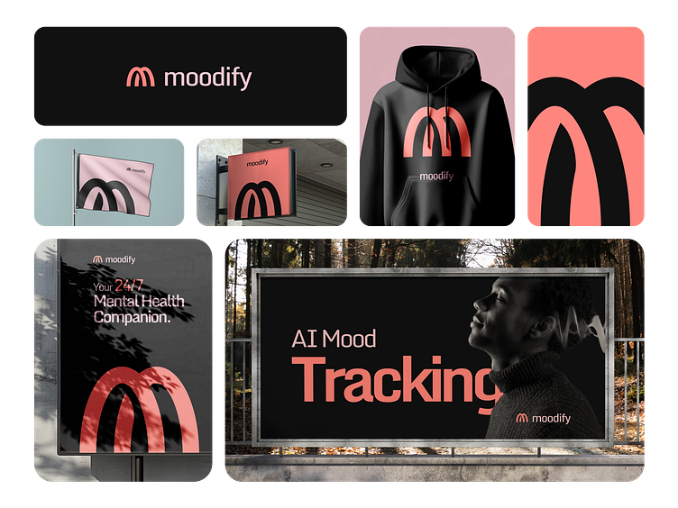
• Warm Coral (#FF867E): Represents compassion and connection.
• Deep Charcoal (#111112): Signifies grounded professionalism.
• Bright Blues (#006BE9, #04A4F5): Reflect clarity and innovation.
• Refreshing Greens (#027F1D, #3CB66B): Symbolize growth and renewal.
• Soft Pastels (#C5E3E5, #F0C6CF): Add calm and approachability.
• Typography: The Monda typeface balances modernity and warmth with clean, geometric forms and rounded edges. This ensures clarity in communication while maintaining a human, approachable tone.
• Logo Design: Two separate arches form an “M” monogram, symbolizing the fusion of human connection and AI technology. This simple yet meaningful design captures Moodify’s commitment to providing transformative and personalized mental health support.
Our Approach
The design process began with an exploration of Moodify’s core values—hope, empowerment, and belonging. These emotions guided every design decision, ensuring the identity would resonate deeply with users.
By weaving together a cohesive visual system, Moodify’s branding communicates ease of use, accessibility, and reliability. Whether it’s through the inviting color palette, approachable typography, or thoughtful logo design, every element reflects Moodify’s holistic mission to make mental health support accessible and transformative.
Conclusion
Moodify’s branding was crafted to transcend aesthetics, becoming a reflection of its mission to revolutionize mental health care. From the comforting tones of its palette to the symbolic “M” monogram, every design choice underscores its commitment to innovation and care. This case study sets the stage for a platform that inspires trust and connection, redefining mental health support for a modern world.


