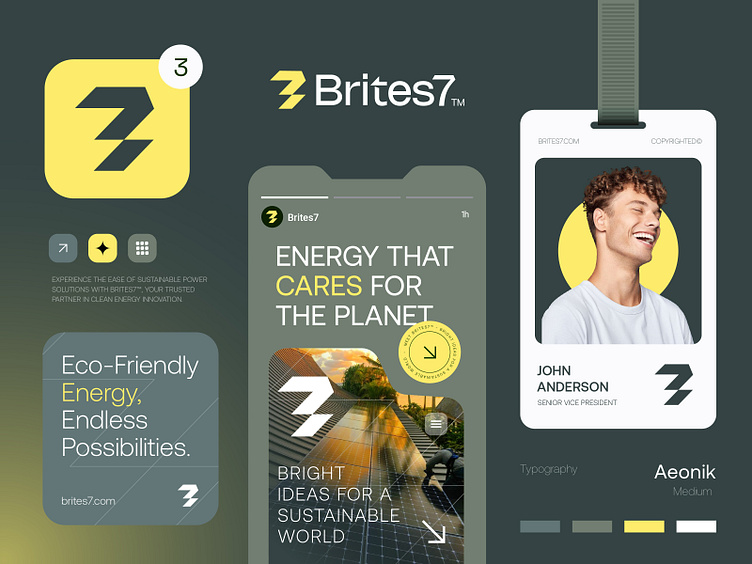
Brites7™ - Logo & Branding for an Eco Energy Power Brand.
Another Challenging Logo & branding Design project I've just finished for Brites7™, an eco-energy brand dedicated to sustainability and innovation. I created a clean, vibrant logo that represents Brites7's™ commitment to renewable energy. Every detail reflects harmony and reliability.
Concept: Letter B + Bolt + 7
Color Psychology: Yellow and green represent eco-energy by showing the sun's power (yellow) and nature's freshness (green). Together, they symbolize clean energy, sustainability, and a healthy planet.
Press "L" to show your love ❤️️
Projects 📩
W: https://wa.me/+8801705553455
Let's Connect 👋
© Rahid Rehman
More by Rahid Rehman | Branding & Logo Designer View profile
Services by Rahid Rehman | Branding & Logo Designer
Like
