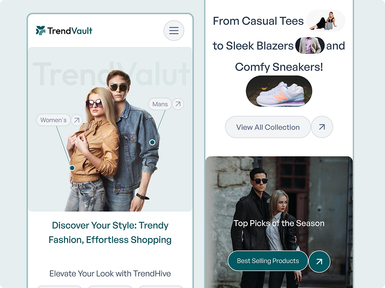
Trend Vault Mobile Responsive Fashion website
A mobile-first transformation of TrendVault's fashion e-commerce platform, where style meets seamless responsive design. Every pixel perfectly adapts to provide an optimal shopping experience on the go!
Responsive Features
Adaptive Layout System
Fluid grid transitions from desktop to mobile
Stackable content blocks for vertical scrolling
Touch-optimized navigation
Perfectly scaled typography across devices
Responsive image containers that maintain aspect ratios
Mobile-Optimized Components
Hamburger menu for space efficiency
Full-width product cards
Touch-friendly CTAs
Thumb-accessible action buttons
Swipeable product galleries
What makes this design special is how it maintains the premium fashion experience of TrendVault while perfectly adapting to mobile viewing. The responsive implementation ensures that whether you're browsing on a small phone or a large tablet, the experience remains equally elegant and functional.
Collaborate with me! Drop a line at rayhannasirinfo@gmail.com or Visit at -rayhannasir.com
Follow me for more amazing designs:
Don't forget to like and share your valuable feedback in the comment section.
