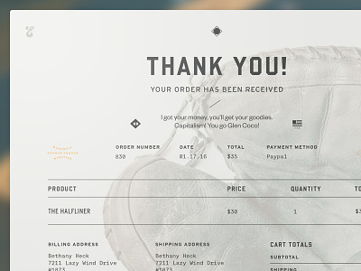
Order Confirmation
One of the things about working on a project for nearly a year is that you get to stare at it long enough that you feel like changing everything. I wanted to go back and reduce the contrast on some of the page designs in the site to see how they felt, and I started with the order confirmation page. I also added some fun fiddly bits.
What do you guys think? Larger versions attached!
More by Bethany Heck View profile
Like

