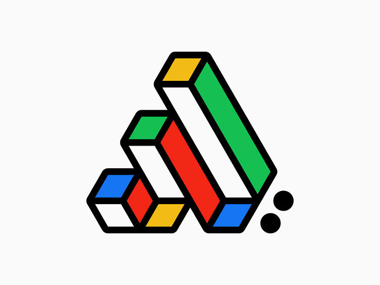
Letter A, 3D, optical illusion - Logo design, branding, bauhaus
Back to daily design practice as usual, and this time I experimented with 3D shapes with an optical illusion that I intentionally crafted to look confusing. The concept of this logo design represents the letter 'A,' which, of course, doesn’t appear as the letter 'A' unless clarified with a fictional brand name starting with the same letter.
This logo design concept is also inspired by the Bauhaus style. Lately, I’ve been very intrigued by Bauhaus design. And if you’re wondering about the two circles on the right side, I placed them there to balance the composition—at least that’s what I think—so it doesn’t look odd. I don’t know, this is just a daily design practice that might look terrible. What do you guys think? Any suggestions?
More by Satriyo Atmojo View profile
Like


