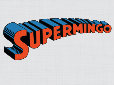
Logo v.1
a few months back i did this logo for my free lance works,
and i have come to dislike the empty area of the right bottom corner, and it has become a pain in layouts as well with alignment, etc
would love your views on this and how to improve it,
i have also attached another version i completed today which im hoping will solve the problems i have with this logo.
which one is best?
More by Matt Alderson View profile
Like
