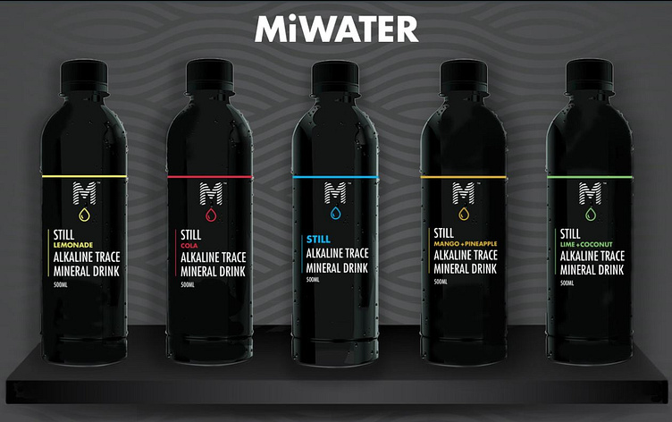
Don't drink ordinary, drink MiWater
Elevating Hydration with Style and Substance
For MiWater, I crafted a comprehensive visual identity that embodies the brand’s innovative essence. This included designing a sleek and modern logo, striking drink labels, promotional flyers, and a cohesive visual identity that highlights the uniqueness of MiWater’s product.
MiWater stands out as a still, alkaline, trace mineral black water enriched with fulvic minerals—natural electrolytes from ancient organic plant matter. Its dark colour signifies purity and health, offering anti-oxidizing benefits, enhanced hydration, and PH balance. Despite its bold appearance, MiWater tastes like ordinary water, making it both approachable and beneficial.
The design approach blends clean lines and vibrant contrasts to reflect MiWater’s dual focus on cutting-edge health benefits and everyday usability. The logo and label designs emphasize its modernity and health-forward appeal, while the promotional materials maintain an engaging and aspirational tone, positioning MiWater as the perfect balance of style and wellness.


