Everbook Logotype Design / Branding WIP
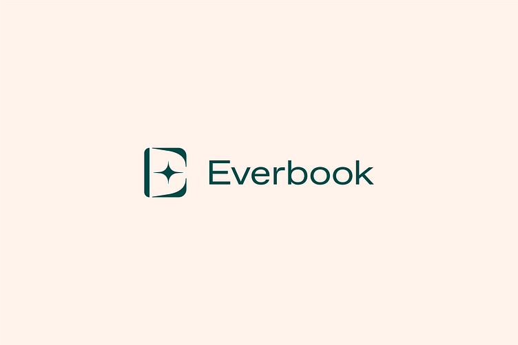
Here is my latest and personal favorite Everbook Combination Logotype Design.
The Icon (Open Book with Starburst): The symbol resembles an open book, symbolizing storytelling and the permanence of a printed memory. At the heart of the book is a starburst, representing a spark of memory, inspiration, or a cherished moment. The starburst emphasizes the precious nature of the stories Everbook preserves, giving life to memories that shine forever.
Typography: The modern, clean typeface communicates trust, sophistication, and clarity—key values in crafting a professional, heartfelt product. The lowercase letters make the brand feel approachable and personal, aligning with Everbook's mission to deeply connect with its users.
Color Palette: The deep green exudes a sense of calm, heritage, and timelessness, reflecting the enduring quality of a hardcover book. Paired with the soft background tone, it creates a warm, nostalgic, and inviting aesthetic.
Visual Harmony: The balance between the icon and typography reflects the harmony of Everbook's process—turning complex, personal stories into polished and elegant keepsakes.
This logotype concept encapsulates Everbook's vision of combining cutting-edge AI technology with the intimacy of personal storytelling, offering users a way to preserve their memories in a beautiful, enduring form.
