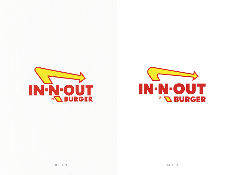
IN-N-OUT Logo Redesign
As a year-end creative project, I decided to redesign the logo of one of my favorite fast-food chains, In-N-Out. While I have a deep appreciation for their burgers, I felt their logo could benefit from a modern update. In my redesign, I focused on refining several key elements: adjusting the angles of the arrow and the ‘-N-’, modifying the width of the ‘T’; repositioning the registration mark; and updating the typeface and legibility of “BURGER.” My goal was to maintain the familiar feel of the original logo while presenting a contemporary interpretation for 2024.
More by Toby Riley View profile
Like
