Skincare Reimagined – Minimalist Website Design
Introducing my latest design for a skincare e-commerce website! 🧴💧
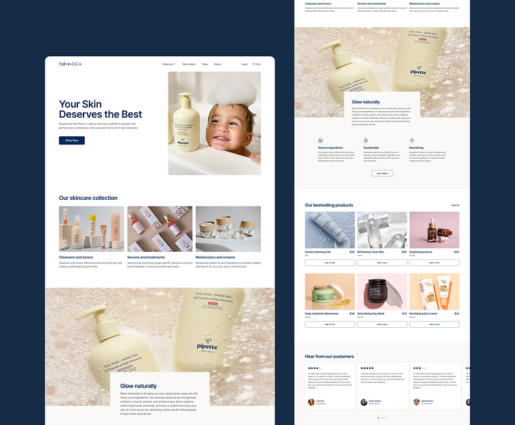
Design Concept
The idea behind this project was to create a clean, breathable design that mirrors the feeling of fresh, hydrated skin. Using a minimal approach, the website emphasizes clarity, usability, and aesthetics ensuring the products take center stage.
Key Features
💎 Welcoming Hero Section: A playful, relatable hero image paired with a compelling headline immediately sets the tone for trust and care.
💎 Streamlined Navigation: Easy-to-access menus, product categories, and CTAs make exploration effortless.
💎 Clean Product Showcases: With elegant grids and soft visuals, the product collections are neatly categorized for easy browsing.
💎 Storytelling through Imagery: Every visual highlights the brand’s commitment to quality, sustainability, and natural ingredients.
💎 Customer-Centric Touches: From glowing testimonials to highlighted bestsellers, every section works towards building trust and enhancing the shopping experience.
Why This Design?
I focused on a less-is-more philosophy, eliminating distractions and guiding the user’s journey effortlessly. The goal is for the design to feel as refreshing as the products themselves!
Technical Highlights
✅ A responsive approach to ensure seamless browsing across devices.
✅ Thoughtfully chosen typography to evoke elegance and calmness.
✅ Generous use of white space to keep the interface airy and comfortable.
Note: This website concept and its assets were inspired by Relume Challenges
What do you think? I’d love to hear your thoughts on this one! Drop a comment or a like if this design resonates with you. Your feedback keeps me inspired to create more! 🙌
