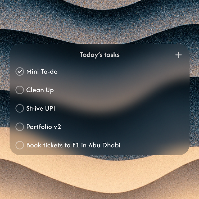
To-do widget design concept
I noticed luck of hierarchy, so I added transparency to secondary elements and text.
Also adjusted font size and thickness which also improved hierarchy.
To make design look modern I added glassy effect to the background and changed font to "Afacad" which looks more sharp compare to previous one.
More by Dani View profile
Like
