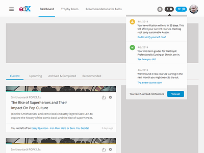
edX Dashboard UI Directions
Some early concepts created while the UX explored how to help learners jump back into their courses and lessons. This graybox + comp focused on how navigation and notifications would work alongside Dashboard content.
More by edX View profile
Like
