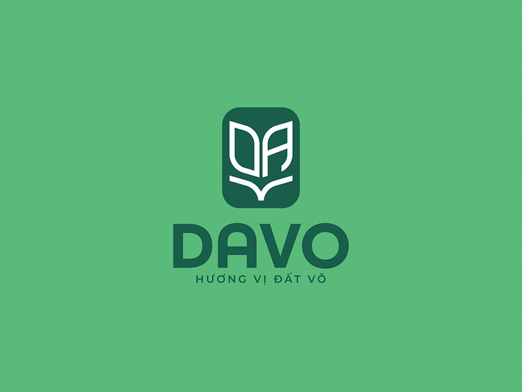
DAVO | LOGO DESIGN & BRAND IDENTITY
Born in the homeland of Binh Dinh - a place famous for its resilient spirit and strong national identity, Davo is not only a food brand, but also a warm greeting from the people of the martial arts land to people far away from home and visitors from near and far.
Since its inception, Davo has always kept in mind one thing: "Must preserve the culture, traditional flavors of the homeland and spread to all regions of the Fatherland". This has posed a problem for Bee Art about a brand identity that harmoniously combines traditional identity and modern breath. A logo that meets the requirements of a flexible symbol and the message "Flavor of the Land of Martial Arts," not only conveys the spirit of Binh Dinh but also spreads culinary pride to every Vietnamese family.
The Davo logo was conceived by the Bee Art design team based on those core values. With the main green color symbolizing freshness and safety, reminiscent of traditional pride, the logo not only exudes the spirit of the land of martial arts but also brings a sense of friendliness and closeness to consumers. The symbol and the word "DAVO" are stylized to be compact and modern but do not lose the brand's characteristics, making it easy to apply on packaging and communication platforms.
Designed by Bee Art
-
Client Davo
Logo and Branding Project. Logo is design for Food Brand.
Copyright© Bee Art. All Right Reserved
Contact us:
• Hotline/ Zalo: (+84) 77 34567 18
• Email: info@beeart.vn
• Website: www.beeart.vn
• Facebook: https://www.facebook.com/BeeArt.vn


