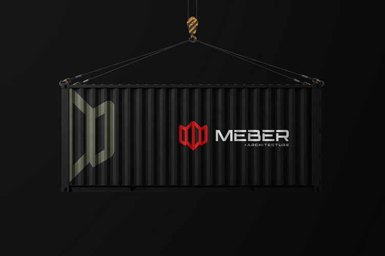
Meber Architecture Brand Identity design
🚀 Project Brief for the Logo 🚀
🎯 Client Name: MEBER Architecture
🎯 Industry: Architecture and Construction
🎯 Objective: Create a logo that conveys MEBER Architecture's values of innovation, precision, and modernity while emphasizing their expertise in architecture and construction. The logo should be versatile enough for digital media, print, and branding on physical assets such as containers and promotional materials.
🎯 Target Audience:
- Property developers
- Real estate companies
- Corporate clients seeking architectural services
🎯 Key Requirements:
- Incorporate the letter "M" as the central visual identity.
- Reflect the construction industry through design elements or shapes.
- Ensure the design is minimalistic, bold, and modern.
- The logo should work well on a black or white background and retain clarity when scaled.
🎯 Design Goals:
- Recognition: The logo should be distinct and recognizable within the architecture and construction industry.
- Versatility: It should adapt to multiple formats (web, print, signage, branding on containers).
- Professionalism: Represent the company’s expertise and modern approach.
🚀 Design Problem and Solution 🚀
🚀 Problem:
- Balancing the need for a minimalistic and professional look while representing both the "M" of MEBER and the architectural/construction theme in a visually engaging way.
🚀 Solution:
🎯 Geometric Design Inspired by Construction Forms: Utilize geometric lines to create a bold and structured "M" that aligns with architectural forms such as beams, scaffolding, or building outlines. In this case, the logo effectively integrates the letter "M" in a three-dimensional style, symbolizing structures or frameworks.
🎯 Color Scheme:
Primary Colors: The red highlights dynamism and passion for innovation, while the dark olive green conveys a connection to the construction industry's earthy tones.
Neutral Base: White and black are used to balance vibrancy and professionalism.
🎯 Typography:
A modern, sans-serif typeface for "MEBER" reinforces the brand's focus on innovation and simplicity.
The smaller "Architecture" underlines the company’s domain in a subtle, elegant way.
🎯 Testing for Versatility: The logo's adaptability on containers, black backgrounds, and marketing materials confirms its multi-purpose usability. The strong contrast ensures visibility even in outdoor environments.
🎯 Implementation Plan:
🎯 Mockups: Apply the logo on various mediums (containers, signage, stationery, and digital platforms).
🎯 Refinements: Collect feedback and adjust details like spacing, alignment, or contrast to ensure the logo remains impactful across all formats.
🎯 Delivery: Provide logo files in vector format along with style guides for consistent branding.
🎯 Why This Solution Works:
It aligns perfectly with MEBER Architecture's branding needs, creating a logo that is bold, industry-relevant, and timeless.
The modular design offers high scalability and adaptability, ensuring the brand can be effectively showcased in any format or environment.
Full Project On --> Behance
🤑 Available For Sale 🤑
WhatsApp 🔰
Email 🔰
-------------------------------------------------------------
Press "L" if you like it and comment on your feedback.
-------------------------------------------------------------
🔰 Follow Me On 🔰


