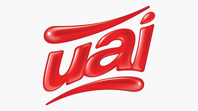
Refrigerantes Uai
Uai is a well-established beverage brand with an extensive lineup of bottled carbonated drinks. I was entrusted with the long-overdue redesign of their logo.
Their old logo was outdated, poorly executed, and inconsistently applied across the product line, which significantly impacted the brand's perception, making it appear as offering low-tier products.
The first step was to harmonize the lettering while maintaining brand recognition. We identified that the flat colors made the logo appear lifeless, so we decided to give it a volumetric character to enhance vibrancy and help the brand stand out on supermarket shelves.
Since the logo needed to be a scalable vector, it required meticulous work to create gradient meshes over the flat form. This process alone took many days, not only due to the complexity of constructing harmonious meshes but also because of the many possible reflection and color patterns that had to be carefully selected.
The end result successfully preserved Uai's brand recognition while conveying the freshness of their products.


