South African Airways Carbon Offset Redesign
Landing
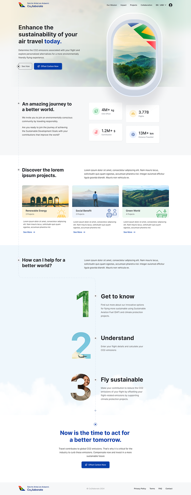
I designed a homepage that reflects the brand’s identity and aligns seamlessly with its color palette. The layout guides users step-by-step, ensuring a visually engaging experience while capturing their attention and enhancing usability.
Your feedback is valuable to me, I look forward to your likes! 💜
Offset Page
✈️ I structured the interface with an action area on the left and a certificate summary on the right. Upon flight selection, the right panel displays the convertible carbon amount, complemented by icons illustrating its equivalent to encourage engagement. To emphasize the brand’s eco-friendly identity, I integrated its symbolic logo elements in green as a subtle certificate backdrop.
👉🏻To enhance usability, I highlighted the active step and designed the step flow to resemble a flight route for a more engaging experience. For package selection, I presented the three projects mentioned on the homepage as selectable packages, ensuring consistency and familiarity.
• The certificate created step-by-step on the right side of the screen is revealed on the final screen once all steps are completed.
• To encourage users to utilize the project, I added options to download and share the certificate.
• A green background was used to emphasize the user’s contribution to the environment, incorporating logo symbols to highlight the brand identity.
• Data from the homepage was reused to underline the contribution to the planet, enhancing personal satisfaction.
• A thank-you section was added at the end of the page, along with an action button to allow users to make further contributions and restart the process. 🌟


