Theory of Tea
What is Theory of Tea?
Theory of Tea invites customers to embrace the serene ritual of tea-making, where every cup embodies purity, mindfulness, and nature. The brand centers on timeless elegance, offering the finest tea leaves that elevate daily moments into a celebration of refined flavors and aesthetics.
Project Overview
The identity for Theory of Tea needed to:
-reflect the values of mindfulness and purity.
-evoke the timeless elegance of the product.
-showcase a connection to nature while maintaining simplicity.
-appeal to an audience seeking high-quality, luxurious tea experiences.
The Solution
The visual identity for Theory of Tea was crafted to encapsulate the brand’s serene philosophy:
A Palette of Calm
A muted, nature-inspired color palette was chosen, incorporating soft greens, warm beige, and pale floral tones. This choice echoes the natural origin of the tea leaves while evoking a calming and tranquil atmosphere.
Pause in the Everyday
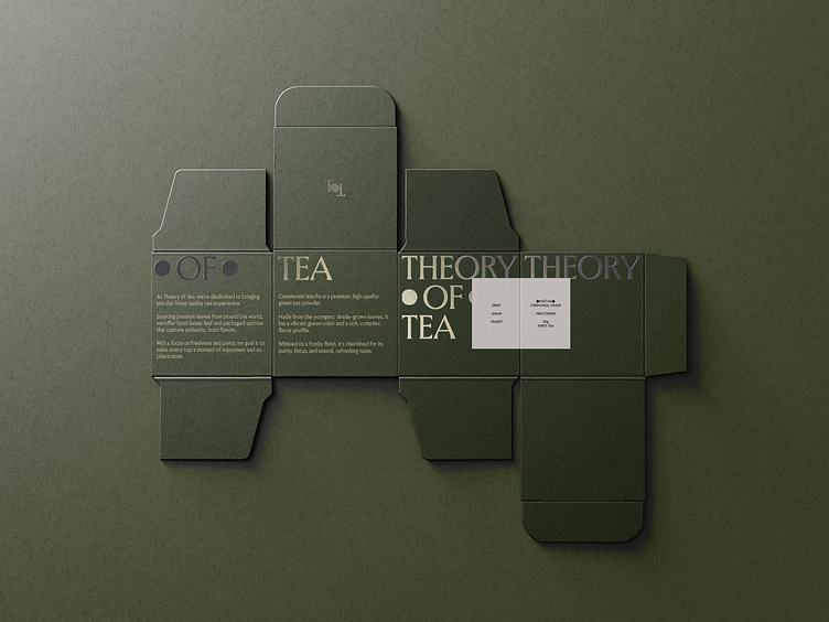
The Theory of Tea logo cleverly segments the brand name with a round shape, symbolizing a brief, peaceful break amidst the hustle of daily life. This circular element represents a moment of joy and mindfulness, inviting people to take a pause and indulge in the calming ritual of tea. The separation between the words visually reinforces the idea of a restorative space, perfectly capturing the essence of the brand’s invitation to slow down and savor simplicity.
Telling a Tale
Classic font pairings of serif and sans-serif styles communicate sophistication and tradition, balanced by a clean and modern touch. This reinforces the brand's emphasis on purity and refinement.
Flourishing Florals
Delicate floral arrangements were used as key design elements, symbolizing the natural and artisanal qualities of the tea. These motifs were shown with simplicity, avoiding clutter to maintain a minimalist aesthetic.
Unboxing the Story
The packaging design transforms the tea box into a canvas for storytelling. The design wraps seamlessly around the box, creating a continuous narrative that unfolds as the packaging is opened. Each side contributes to the visual journey, with subtle patterns and delicate images that flow from one panel to the next. This immersive approach not only enhances the unboxing experience but also reinforces the sense of mindfulness and attention to detail that defines Theory of Tea.
Brewing Online Presence
The social media presence for Theory of Tea mirrors the brand's calm and refined essence. A muted color palette creates a cohesive look, drawing directly from the packaging design for consistency and clarity. Informational panels—designed with clean layouts and ample white space—echo the packaging’s visual language, offering clear, concise messaging. The thoughtful mix of serif and sans-serif fonts balances tradition with modernity, making each post visually engaging while maintaining the brand’s serene sophistication. This approach ensures that every interaction feels like an extension of the tea experience, whether online or in hand.
The Outcome
The Theory of Tea brand successfully bridges the gap between tradition and modernity, appealing to both connoisseurs and those new to tea appreciation. Its visual identity not only communicates the elegance and purity of the product but also invites customers to slow down and savor the moment—a reflection of the brand's core values.
Through this carefully curated design, Theory of Tea establishes itself as more than a beverage—it becomes a lifestyle choice, resonating deeply with its audience.


