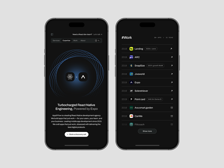
Mobile-only layout
We've pushed beyond mobile first for App&Flow latest website update – mobile only with an ultra narrow container (520px on desktop) to make the single page look and feel like an app. That seem like an honest way to present a App dev studio, equally nice to avoid responsive issues.
More by Nicolas Solerieu View profile
Like
