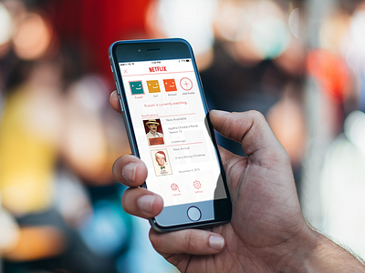
Netflix for iPhone - Improved Hamburger Menu
In my last Netflix post, I compared the use of a hamburger menu to a tab bar. Unfortunately, I did not think to actually create a useful menu at the time. This is an updated version of that menu. In this one, I've allowed the user to interact with the profile chooser and incoming notifications instead of hiding them behind icons.
Check out the attachments for a higher res version.
More by Samir Shekhawat View profile
Like


