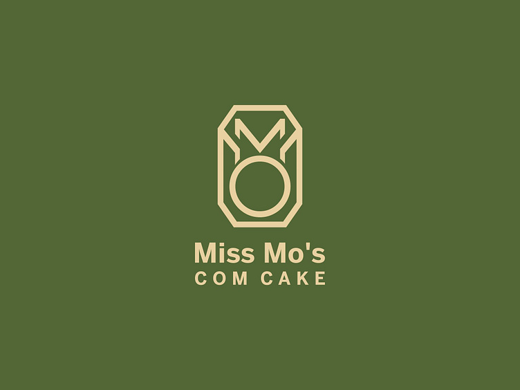
MISS MO'S COM CAKE | LOGO DESIGN & BRAND IDENTITY
The story that Bee Art wants to share today is about a brand that sells traditional Com Cake products "Miss Mo's Com Cake". The product itself has posed a difficult problem for the Brand in terms of competition when consumers in general and customers in Hanoi in particular are too familiar with "Banh Com Hang Than" - that to buy Banh Com, you have to go to Hang Than street.
This poses a concern for the brand owner when having to solve the problem of brand identity so that it stands out, the logo must show tradition but still have to reach young customers. Miss Mo's Com Cake shared this challenge with Bee Art and also expected a creative and sophisticated design from us.
Throughout the project, Bee Art's creative team has always set strict requirements for themselves to both put the brand name into the Logo and skillfully combine the two tones of Blue-Yellow in an elegant and traditional way. With such a task, we started to implement, refine and complete. And we are very pleased to receive customer satisfaction with the stylized logo with the two letters M, O combined with the image of the cake mold to emphasize the brand's investment in the core product. With a sophisticated design and warm colors, our final product has created a sense of closeness and evokes the delicious and unique green rice cakes.
Designed by Bee Art
-
Client Miss Mo's Com Cake
Logo and Branding Project. Logo is design for Bakery.
Copyright© Bee Art. All Right Reserved
Contact us:
• Hotline/ Zalo: (+84) 77 34567 18
• Email: info@beeart.vn
• Website: www.beeart.vn
• Facebook: https://www.facebook.com/BeeArt.vn


