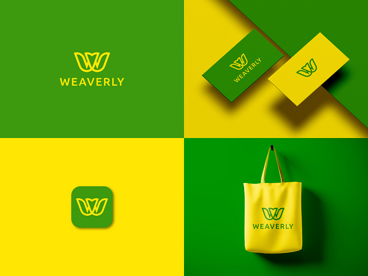
Weaverly logo/ W logo
The logo design represents a brand called Weaverly. Based on its elements:
Nature-Inspired Design: The emblem resembles a stylized "W" shaped like leaves or petals, suggesting a strong connection to nature, sustainability, or organic products.
Color Palette: The use of green and yellow evokes natural growth, freshness, vitality, and eco-friendliness, often associated with agriculture, wellness, or sustainable industries.
Minimalistic Look: The clean and modern design appeals to environmentally conscious consumers and aligns with businesses that prioritize simplicity and sustainability.
Applications Shown: The branding on items like tote bags and business cards indicates a focus on consumer products or services, possibly in categories like:
Eco-friendly retail (clothing, bags, or lifestyle products)
Organic or sustainable food products
Gardening, floral, or agricultural services
Wellness or natural beauty products.
Conclusion: This logo likely represents a business tied to eco-conscious, natural, or sustainable goods or services. It appeals to audiences who value environmental awareness and modern aesthetics.

