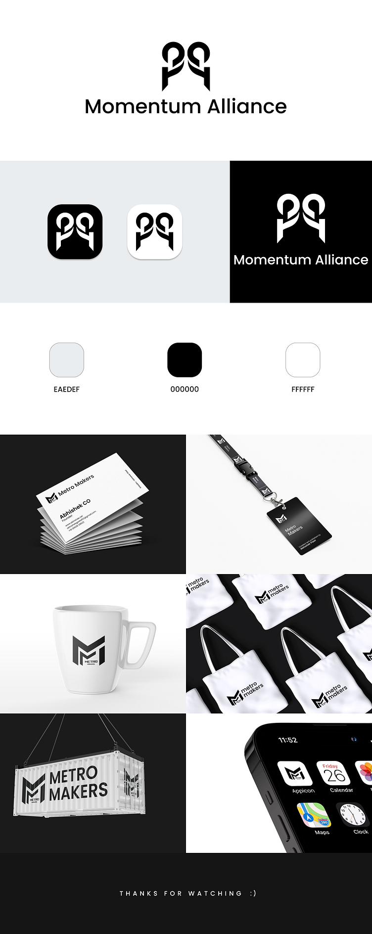
Momentum Alliance Logo Design (Letter M Logo Design)
1. Minimalist Design Simplicity is Key: Minimalistic lettermarks are dominating logo design today. Clean, streamlined typography with few to no additional elements. The focus is on the power of the letters themselves.
2. Monogram Merging Letter Interlocking or Overlapping: Combining letters in a unique way by interlocking or overlapping them has become a powerful way to create a memorable logo. The design of the monogram becomes a visual puzzle for the viewer, which strengthens the brand’s identity.
3. Custom Typography Unique Fonts: Custom-made typography is gaining momentum in lettermark design. This trend ensures that the logo is truly one-of-a-kind and stands out from competitors using standard fonts.
4. Monogram with Symbolic Meaning Incorporating Hidden Symbols: Some brands are using lettermarks to incorporate a secondary, subtle meaning or visual representation. This could be through the use of negative space or combining the letterforms with abstract shapes that represent the company's core values or business. Brand Storytelling: Modern lettermark logos might convey more than just the initials of the company. They can also hint at the brand's mission or philosophy, becoming a visual representation of the brand’s ethos.
5. Bold and Dynamic Colors Vivid Palettes: Although black-and-white lettermarks remain classic, using bold colors is becoming more popular. The use of gradient, neon, or contrasting colors can make the logo more dynamic and stand out, especially in digital media where color vibrancy is noticed more easily.
6. Versatility Scalability: Lettermark logos are often created with scalability in mind. As digital platforms become more diverse in terms of display sizes (mobile apps, website icons, social media), a lettermark logo must be identifiable at any scale. This often means a simple, bold design without intricate details that could become lost at smaller sizes.
7. Flat Design Avoiding 3D Effects: The trend of flat design continues to thrive, meaning that lettermark logos are typically created without gradients, shadows, or three-dimensional effects. This gives the logo a clean and modern look that works well across digital platforms, ensuring it remains crisp on screens of all sizes.
8. Brand Consistency Building Recognition: The lettermark logo trend is often aligned with the idea of building brand consistency. Many companies aim for simple logos that are easy to recognize and remember. Do you need something similar 'Logo Design & Branding Design? then feel free to contact me.
👇Behance
https://www.behance.net/abhishekpatel1011
👇Dribbble
https://dribbble.com/abhishekpatel1011
https://www.linkedin.com/in/abhishekpatel1011/
