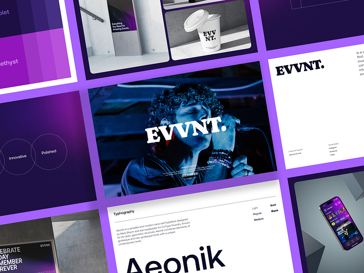
EVVNT - Branding Design Style Guide
Hello 👋
I’m excited to share the third shoot in my EVVNT design series, completing the app and web concepts from the previous post. This time, I've created a comprehensive style guide for EVVNT, showcasing the visual identity of this event booking platform. In this project, you'll find key elements such as logo design, color palette, font choices, and how they all come together to create a cohesive, modern, and event-themed look.
About Clients and Business
EVVNT is an event booking platform that makes it easy for users to find and book events across multiple locations. With a focus on convenience and user experience, EVVNT provides a sophisticated solution to attend your favorite events quickly, conveniently, and seamlessly. The platform features innovative technology that simplifies the process of finding and booking events.
Target Audience
EVVNT is designed for the young generation who are tech-savvy, love convenience, and are looking for an intuitive experience to explore the best events. From music concerts to cultural festivals, EVVNT appeals to those who want to experience special moments in a modern and efficient way.
Appearance and Impression
EVVNT reflects an energetic, modern, and inclusive personality. The primary color scheme is dominated by a navy blue palette that symbolizes trust and professionalism, with bright accents to convey a sense of enthusiasm and happiness. The font choice incorporates a modern sans-serif for easy readability, creating a clean yet engaging look.


