Hero
✋ Hello!
👉 General Style:
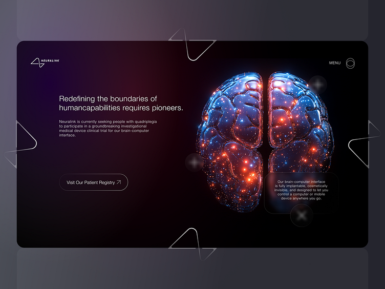
• The design is minimalist and futuristic, using dark tones and bright accent colors.
• The center of attention is the image of the brain, illuminated by dots of light, creating a sense of network activity. This immediately evokes associations with advanced technologies and human-machine interfaces.
👉 UI Elements:
• The Neuralink logo in the upper left corner is simple and concise.
• Central Text: The main message is highlighted in white on a dark background, making it easy to read.
• CTA (Call-to-Action) Button: At the bottom, there is a button with the text "Visit Our Patient Registry" and an arrow icon pointing to the action. The button is noticeable but unobtrusive.
• Menu: In the upper right corner is a menu icon in the form of a circle with three lines, which hints at adaptability and modernity.
• Background Graphics: Abstract shapes (triangles) are added, creating page dynamics.
👉 Font and Text:
• A simple, legible sans-serif font is used.
• The main text is divided into paragraphs: the key phrase "Redefining the boundaries of human capabilities...," is highlighted, and the rest of the information supports the main idea.
👍🏻👍🏽👍🏾 Don't forget to press "Like" if you like. Thanks!
