UI Input Elements – Light & Dark Mode
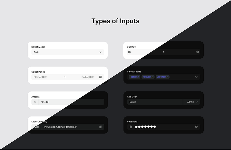
A clean and modern collection of input field designs, showcasing variations for both light and dark modes. The set includes dropdowns, range pickers, counters, multi-selections, currency inputs, and password fields.
Each input type is crafted with attention to accessibility and user experience, ensuring functionality and aesthetics blend seamlessly. The password field stands out with its concealed input represented by stars (★) instead of the usual dots, adding a subtle but distinctive touch to the user experience. An integrated toggle button allows users to reveal or hide their entered password securely. Each input type is crafted with attention to accessibility and user experience, seamlessly blending functionality and aesthetics.
Perfect for use in dashboards, forms, and other interactive UI components. Feedback and suggestions are welcome!
#UI #Design #LightMode #DarkMode #inputs #input #Forms
Light Mode
A crisp and minimal design emphasizing clarity and simplicity. The light mode features soft greys and whites, providing excellent readability and a clean aesthetic. Subtle shadows and borders define the input fields, ensuring they are visually distinct yet cohesive with the overall interface. Perfect for bright and professional environments.
Dark Mode
A sleek, modern approach designed for low-light or focused settings. The dark mode employs deep blacks and greys with subtle highlights to emphasize interaction points. Text and labels are styled with contrasting light tones for excellent readability, while accents like blue tags and icons ensure visual appeal and usability.


