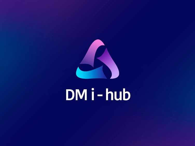
DM I-HUB| LOGO DESIGN & BRAND IDENTITY
DM i-hub (Digital Manufacturing i-hub) is a technology brand founded in 2024 with the mission of connecting needs and solutions through the slogan "Matching needs and i-solution". DM i-hub aims to bring smart, modern technology solutions, helping businesses optimize production processes and comprehensive digital transformation.
As a startup brand in the technology field, DM i-hub faced the challenge of creating a logo that must represent innovation and reflect strong connectivity. To solve this problem, the brand chose the triangle as the main subject representing connection, combined with color bands representing transformation and innovation. Bee Art received the request and directed to create a design that met all the elements that the brand desired.
The DM i-hub logo uses the triangle as the main subject, representing sustainability, balance and strength, while expressing multi-dimensional connectivity suitable for the technology field. The gradient color bands moving from blue, purple to pink symbolize continuous innovation, flexibility and constant development. The soft design of the color bands evokes the infinity symbol, implying the unlimited creativity of sustainable solutions. The modern font and subtle color palette convey a sense of trust, creativity and energy, reflecting DM i-hub's vision of connecting needs and technological solutions.
Designed by Bee Art
-
Client DM i-hub
Logo and Branding Project. Logo is design for Technology Company.
Copyright© Bee Art. All Right Reserved
Contact us:
• Hotline/ Zalo: (+84) 77 34567 18
• Email: info@beeart.vn
• Website: www.beeart.vn
• Facebook: https://www.facebook.com/BeeArt.vn


