Checkout page
I designed this checkout page to be simple and easy to navigate.
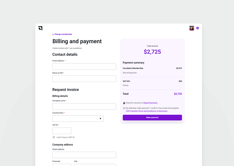
The text fields have clearly visible labels, a focus state, and high color contrast for better accessibility. The inputs are organised into distinct sections to improve navigation and make it easier to fill out the form.
Mandatory fields are clearly marked, and the description at the top of the form explains the meaning of the '*' symbol, so users know right away how to read the form and what is expected of them.
