User profile
Day 006 of the DailyUI Challenge.
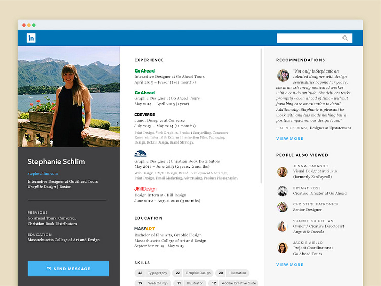
Spent my morning rethinking how LinkedIn displays their user content. The idea is that the left column functions as a quick profile overview with CTA to message. The center column scrolls to show a long-form resume with skills, awards, etc. The right column shows one recommendation and 1-10 other profiles, based on the length of the recommendation shown.
More by Steph Lynch View profile
Like
