Hourly Website Design and Rebrand
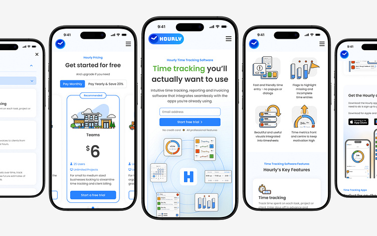
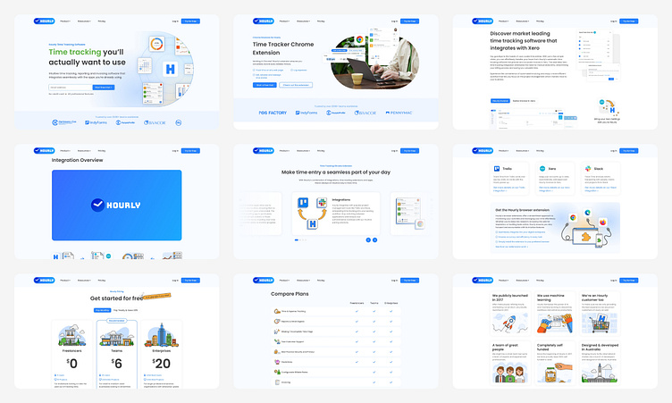
A selection of views from the Mobile UI
Rather than including every page from the mobile UI, I wanted to showcase a selection of different components and styles that collectively represent the new Hourly design style. I’ve used a combination of UI screenshots and illustrated UI reconstructions within a simple website layout to optimise the user experience.
Above is a short video showing the subtle animation in the hero section of the landing page on mobile.
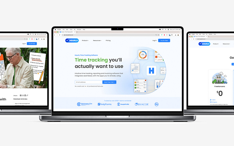
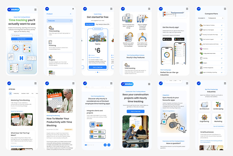
A selection of views from the Desktop UI
Similar to the mobile UI above, I have selected a number of screens from the Hourly desktop website to showcase different elements of the new design style.
Above is a short video showing the subtle animation in the hero section of the landing page on a laptop.
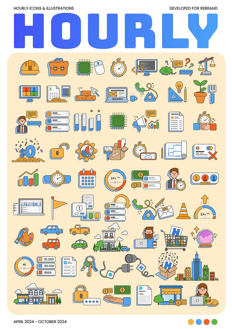
New Hourly Branding
In addition to improving the user experience of the Hourly website, I also redesigned much of the branding to refresh the styling, which hadn't been updated since 2017.
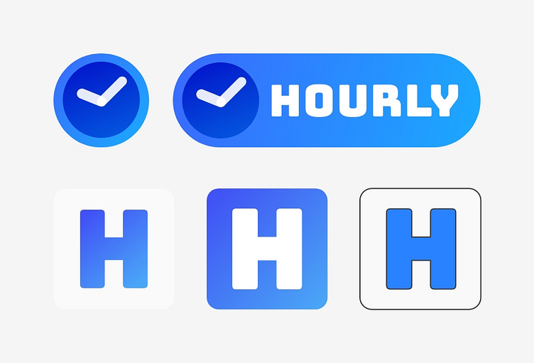
Above is a selection of new and old logos/icons to be used in different contexts.
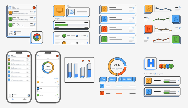
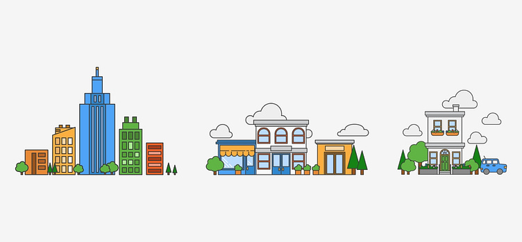
I have also included some UI illustrations I created using Adobe Illustrator to broadly represent parts of the software.